
Arrangement
Before I began decorating these autumn seasonal arrangements, I went on an adventure. I took a local day trip to Coastal Black Winery & Pumpkin Patch both inspired the creative senses beautifully, and made a quick stop over at Rally Co. in downtown Courtenay. Before hitting the country road, I scanned over the big areas around my home that needed decorating. The mantel, the doorway and the dining table would be the larger areas to focus on this year while all the other little spots would be complementary.
It is important to draw things together from space to space, especially if they are all joined in one view. Every year my arrangements are slightly different as it is nice to keep things fresh with upcoming trends. This doesn’t mean buying a whole new set of decorations. Simply change the placement of things or buy one or two items on sale. As I say this, I can totally see myself now, running out of the store screaming “start the car, start the car”! Surely you can agree sales are great, but for some strange reason not so much on the budget when you get more than you intended lol!
All kidding aside, the smallest finds can have such a big impact on the design outcome. The arrangement is simply about how things are placed and how they speak to the bigger picture. Before I get started, I like to visualize the entire space, connect with the room and ensure things will flow and appear cohesive. Then I apply my three other tips in this blog to pull it together.
Colour
60-30-10 rule
When decorating a space it is good to have three colours rather than one or two. Start by selecting decorations like your pumpkins, napkins, table cloths, dishes and other items/ Think of using colour components of 60 percent dominant colour, 30 percent of a secondary colour and 10 percent of an accent colour. This works like a charm and properly balances out the items in that surrounding space, as well giving it a nice pop.
It also helps to have a contrast of warm and cool. For example, a cool greyish blue pumpkin with a warm honey or chocolate coloured table cloth or napkin.That sounds lovely to me! While the overall effect appears restful the two opposites create just enough contrast to wake up the decorated space and make it more interesting to look at. Contrast is such an important thing that I like to add when decorating. Knowing when and where to add the punch depends on patience and trusting a creative flow.
Focal Point
Draw attention
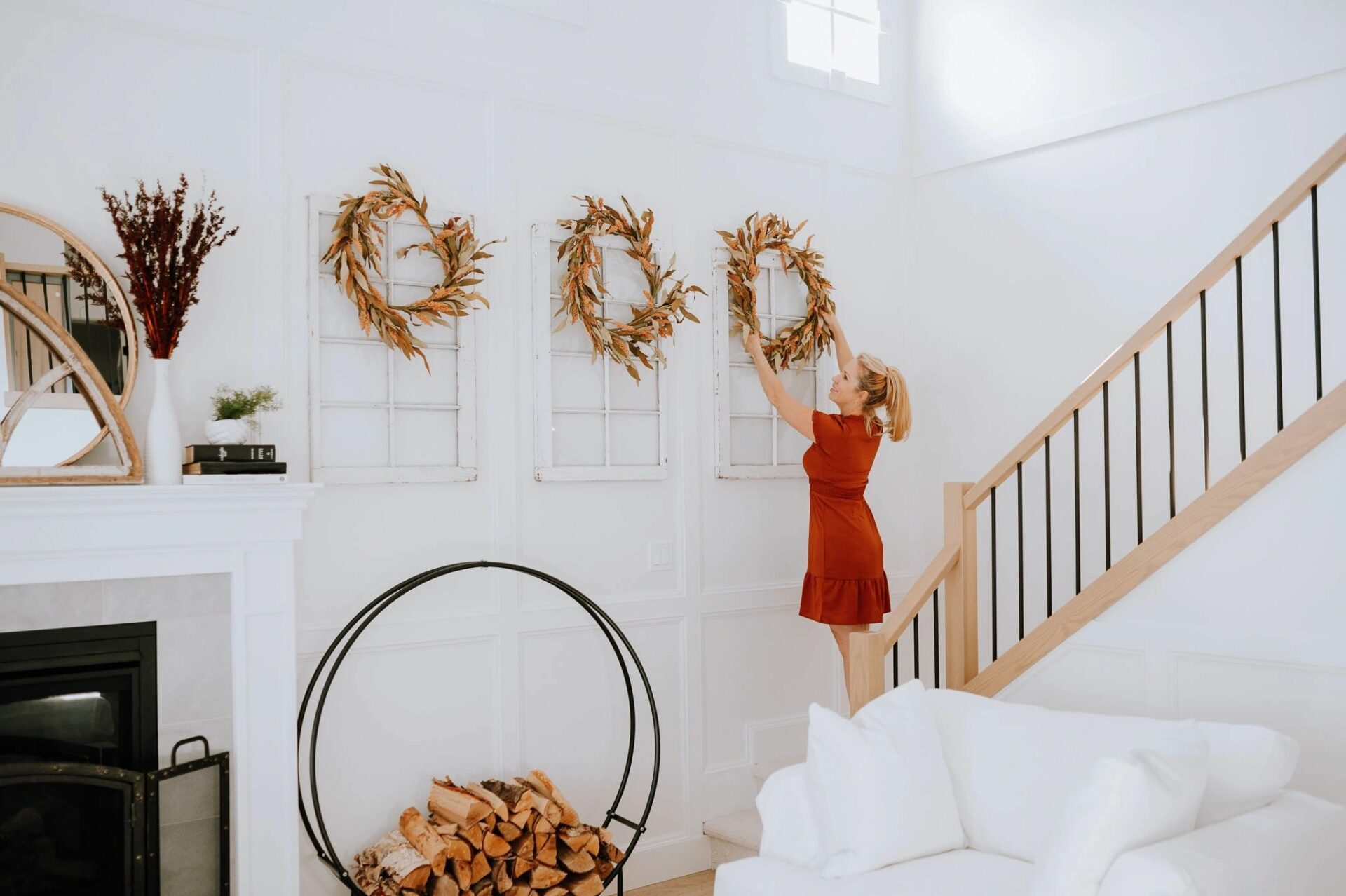
Our new home has 17 foot ceilings and I have never decorated a wall that large before. I had to pay very close attention to where I wanted to draw the eyes. It was very intimidating to create two focal points for these large skyscraper walls, however the risk was worth taking. The secondary focal point, the 4 antique windows from our former 157 year old stone home in Stirling Ontario. For the primary, I chose a large brass framed mirror on the oversized mantel. The secondary focal point actually helps the primary focal point feature stand out and ties the space together that much more. Our living room has lots of natural light and also pot lighting for the evening which is fabulous. I always consider lighting before decorating a space. For later in the evening, I like to add extra twinkle lights which really draw in the attention.
Focal points must be eye catching. For example if you have monochromatic decorations on the mantel, someone may walk by and not even notice. When someone walks into the room and the mantel catches their eye right away, then you know you have worked your decorating magic. Capturing someone’s eye requires a dramatic piece that stands out in size, piece or colour. Whatever the reason (size, piece or colour) it has to draw attention. It could be a large piece of art work or a grouping of items like my antique windows with hung wreaths.